
Hawaiian Airlines
Hawaiian Airlines
Redesigning & Rebranding Hawaiian Airlines
Redesigning & Rebranding Hawaiian Airlines
Duration: 2 Weeks
My role: UX Designer, UI Designer, Research
Duration: 2 Weeks
My role: UX Designer, UI Designer, Research
THE PROBLEM
THE PROBLEM
The current Hawaiian Airlines website does not reflect the brand’s visual identity or communicate the quality of its travel experience, which may lead users to perceive competitor airlines as more trustworthy or appealing, ultimately influencing their booking decisions.
ISSUES
ISSUES
Quantative Issues
Quantative Issues
1.3 out of 5 rating for Customer Satisfaction Rates
7,5 minutes on average it takes to book a flight
68 percent of 1 star ratings on review websites
13 is the score for Customer Loyalty Rates according to Net Promoter Score
1.3 out of 5 rating for Customer Satisfaction Rates
7,5 minutes on average it takes to book a flight
13 is the score for Customer Loyalty Rates according to Net Promoter Score
Qualitative Issues
Qualitative Issues
Lack of personalization for your account
Outdated design graphics and patterns
Poor optimization on different devices
Unnecessary details that confuse guests
Confusing booking flow for ticket purchase
Outdated
Low Trust
Optimization
Confusing
GOALS
GOALS
Re-Design the Hawaiian Airlines Website to enhance brand identity and tackle the issues essential to work flow
Increase the customer loyalty rates
Decrease booking times to be under 5 minutes time frame
Redesign the website to reflect Hawaiian spirit
Strengthen the brand identity
Boost booking booking rates
Increase the customer loyalty rates
Decrease booking times to be under 5 minutes time frame
Redesign the website to reflect Hawaiian spirit
Strengthen the brand identity
Boost booking booking rates
Increase the customer loyalty rates
Decrease booking to be under 5 minutes time frame
Redesign the website to reflect Hawaiian spirit
Strengthen the brand identity
Boost booking booking rates
INFORMATION GATHERING
INFORMATION GATHERING
Information Architecture
De-bunking the old website flow
De-bunking the old website flow
Note all unnecessary steps/information
Note all unnecessary steps/information
Ways to simplify the navigation
Ways to simplify the navigation
Cataloging the main areas of the flow
Cataloging the main areas of the flow
Catalogue of website flows

User Archetypes
User Archetypes
Persona I - Tourist
Persona I - Tourist


Persona II - Hawaii Local
Persona II - Hawaii Local


User Flow
User Flow
Updated user flow streamlines the booking process for a cleaner and more user friendly experience
Updated user flow streamlines the booking process for a cleaner and more user friendly experience
BEFORE

VS
AFTER

RESEARCH DATA GATHERING
User Insight Phase 1 - Interviews
Conducted with the frequent users who used the Hawaii airline services at least two times in the last year

RESEARCH DATA GATHERING
RESEARCH DATA GATHERING
User Insight Phase 1 Interviews
User Insight Phase 1
Interviews
Conducted with the frequent users who used the Hawaii airline services at least two times in the last year
Conducted with the frequent users who used the Hawaii airline services at least two times in the last year
"I wasn’t sure what the difference was between Main Cabin and Main Cabin Basic - I had to look it up separately.”
"I wasn’t sure what the difference was between Main Cabin and Main Cabin Basic - I had to look it up separately.”
"I wasn’t sure what the difference was between Main Cabin and Main Cabin Basic - I had to look it up separately.”
ACTION 1:
Redesigning and simplifying the booking flow. Solution -
Comparison module
ACTION 1:
Redesigning and simplifying the booking flow. Solution -
Comparison module
“The website feels kind of generic — it doesn’t really capture the Hawaiian vibe I expected. It could be any airline.”
“The website feels kind of generic — it doesn’t really capture the Hawaiian vibe I expected. It could be any airline.”
“The website feels kind of generic — it doesn’t really capture the Hawaiian vibe I expected. It could be any airline.”
ACTION 2:
Enhance visual identity, incorporate cultural elements. Solution - Incorporation of Hawaiian Hawaiian language, traditional patterns, etc
ACTION 2:
Enhance visual identity, incorporate cultural elements. Solution - Incorporation of Hawaiian Hawaiian language, traditional patterns, etc
“I tried booking on my phone but gave up — the buttons were tiny, and I had to zoom in a lot. It just wasn’t easy.”
“I tried booking on my phone but gave up — the buttons were tiny, and I had to zoom in a lot. It just wasn’t easy.”
“I tried booking on my phone but gave up — the buttons were tiny, and I had to zoom in a lot. It just wasn’t easy.”
ACTION 3:
Updating the accessibility parameters. Solution -Creating an accessibility switch to turn on enlarged menu option
ACTION 3:
Updating the accessibility parameters. Solution -Creating an accessibility switch to turn on enlarged menu option
User Insight Phase 2
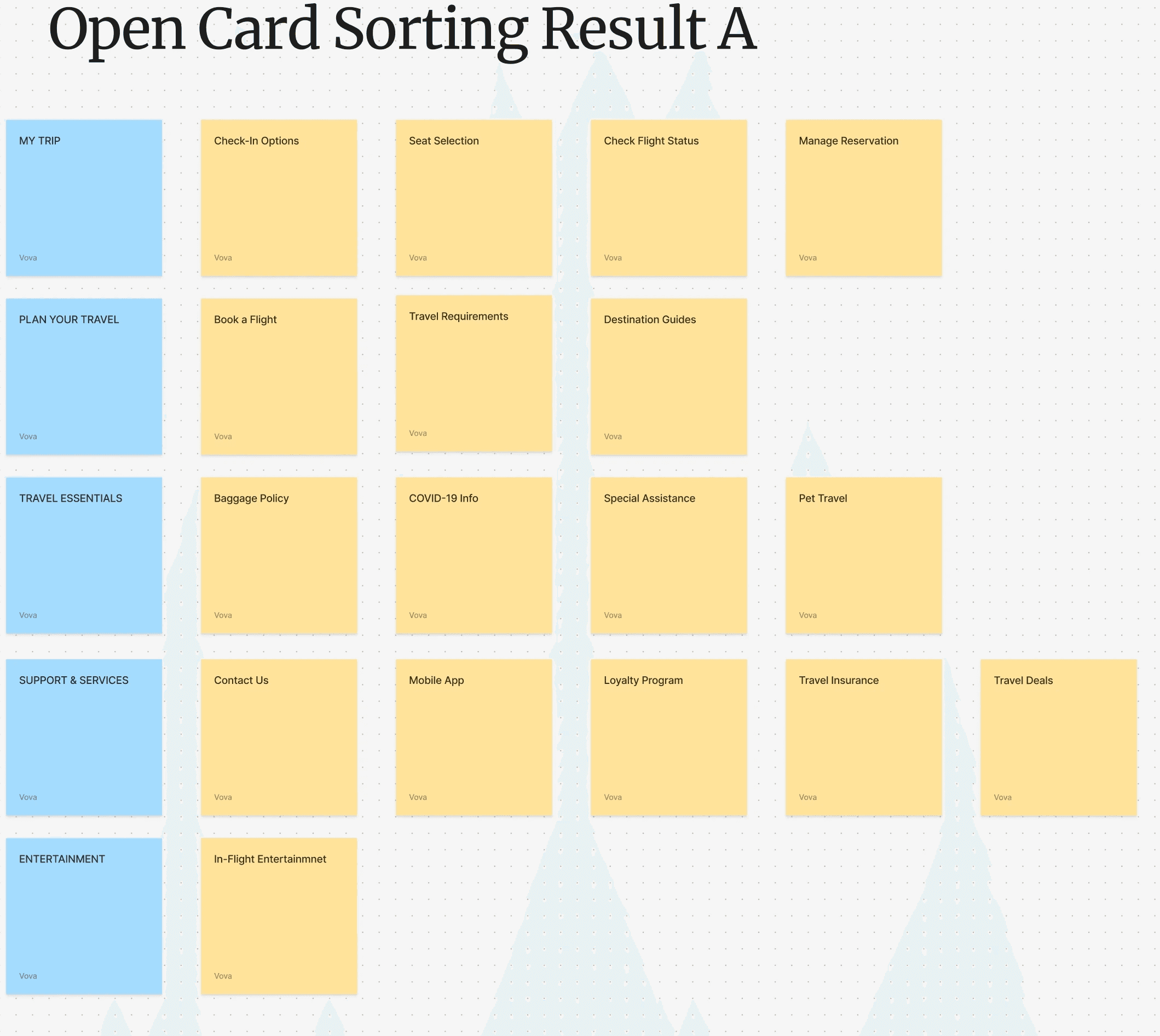
Card Sorting
User Insight Phase 2
Card Sorting
The sample was the users who use any airline services to travel frequently at least twice a year
The sample was the users who use any airline services to travel frequently at least twice a year

Open Card Sorting
Open Card Sorting
Open Card Sorting
No categories were provided
No categories were provided
No categories were provided
Hybrid Card Sorting
Hybrid Card Sorting
Hybrid Card Sorting
Categories were provided, plus allowed to create their own
Categories were provided, plus allowed to create their own
Categories were provided + allowed to create their own

Keys:
"My trip " was a common mental model - users expect anything related to their flight to be in one place
Strong user instinct to seperate pre-flight policies into their own section
"Special Assistance" "Mobile App" appeared in multiple categories across participants. Need to make these items more contextually specific
"Loyalty Programs" "Contacts Us" "Mobile App" - evidence supports organizing these under "Help & Support"
User Insight Phase 3 - Affinity Mapping
User Insight Phase 3 Affinity Mapping
Pattern 1
Users think in terms of their journey, not isolated features. They expect a unified space for all flight related tasks.
Pattern 2
Essential pre-departure content is poorly labeled or scattered, making the planning the most frustrating
Pattern 3
Help-related tools are not visible enough and don't have a consistent home, making them hard to find in urgent moments.
MARKET ANALYSIS
Understanding the Competition
Alaska Airlines weaves loyalty rewards and elite perks into the user journey, creating a personalized, exclusive experience that feels earned.
JetBlue employs a bold, human-centered content strategy that integrates playful language and clear messaging across touchpoints, enhancing engagement without compromising usability.
Southwest reinforces its fee-free model through a streamlined digital experience that clearly communicates a “what you see is what you get” approach.


RESULTS
Solutions for design elements
A Brand That Feels Disconnected from Its Cultural Identity
There is an opportunity to use tone, visuals, and micro-interactions to reinforce cultural connection and brand trust.
Inconsistent Access to Support and Human Help
Support tools should be treated as core navigational elements, not secondary or footer-level content.
Lack of Mental Model Alignment
A re-architecture is needed to bring the site structure closer to users’ task flows and mental models.
Information Overload in the Wrong Places and Scarcity in Others
A rebalancing of information architecture is needed — simplifying dense areas, clarifying categories, and ensuring consistent access to high-priority resources.
Solution Details

UI DESIGN
Wireframes
Font
I selected the Khuja Uppercase font for its clean, flexible letterforms and strong readability across screen sizes. Its organic curves and relaxed structure also evoke a sense of warmth and island-inspired rhythm, aligning with the visual tone of a Hawaiian travel experience.
Icons
Google Material Icons were chosen for their extensive library, consistent design language, and smooth integration with Figma, enabling efficient prototyping and ensuring visual coherence across the interface.
Colors
The redesigned color palette centers on the new branding color DDE586, offering a softer, less harsh visual experience compared to the original scheme. This fresh, tropical tone better reflects Hawaii Airlines’ identity while supporting modern UI principles of clarity, warmth, and brand cohesion.
Layout Grid
The layout was designed specifically for the MacBook 16" screen, ensuring precise responsiveness across a 402 x 874 px frame. Uniform margins, structured alignment, and balanced spacing were implemented to enhance visual structure and improve content legibility.
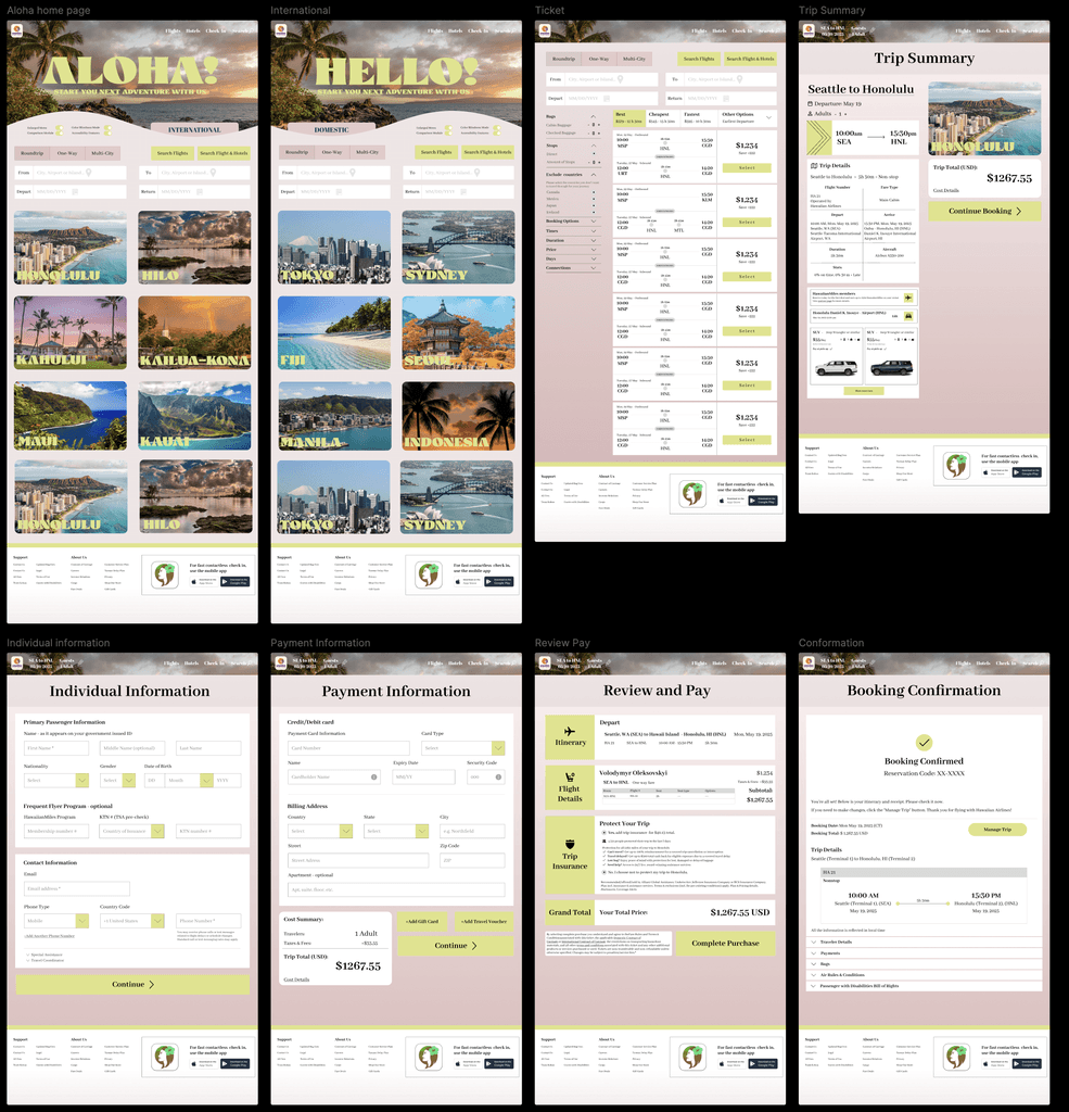
DESIGN SHOWCASE
DESIGN SHOWCASE
Final Design Flow
Final Design Flow
The final flow represents the final design with the implementation of necessary changes and upgrades
The primary objective of streamlining the user flow is evident when examining the catalog of user journeys.
Before

After

MONITORING
MONITORING
Business Impact
Business Impact
Note that, as this is a conceptual project and not conducted for real business, no direct business impact can be measured
Usability Testing
Usability Testing
100%
increase in user satisfaction rates
increase in user satisfaction rates
100%
of participants booked their flights faster than before
of participants booked their flights faster than before
95%
of users found the interface more accessible, citing improved contrast, font size, and screen reader compatibility.
of users found the interface more accessible, citing improved contrast, font size, and screen reader compatibility.
FUTURE
FUTURE
Further Improvements
Further Improvements
Further Improvements
While the redesign addresses key user pain points and strengthens brand alignment, there are opportunities for continued enhancement.
Future iterations could include deeper personalization based on traveler profiles, integration of real-time travel alerts, and expanded accessibility features to support a wider range of user needs.
Additionally, ongoing usability testing with diverse user groups will ensure the site evolves in response to changing expectations and emerging technologies.
RESULTS
Solutions for design elements
A Brand That Feels Disconnected from Its Cultural Identity
There is an opportunity to use tone, visuals, and micro-interactions to reinforce cultural connection and brand trust.
Inconsistent Access to Support and Human Help
Support tools should be treated as core navigational elements, not secondary or footer-level content.
Lack of Mental Model Alignment
A re-architecture is needed to bring the site structure closer to users’ task flows and mental models.
Information Overload in the Wrong Places and Scarcity in Others
A rebalancing of information architecture is needed — simplifying dense areas, clarifying categories, and ensuring consistent access to high-priority resources.
User Insight Phase 2 - Card Sorting
The sample was the users who use any airline services to travel frequently at least twice a year
Outcomes
"My trip " was a common mental model - users expect anything related to their flight to be in one place
Strong user instinct to seperate pre-flight policies into their own section
"Special Assistance" "Mobile App" appeared in multiple categories across participants. Need to make these items more contextually specific
"Loyalty Programs" "Contacts Us" "Mobile App" - evidence supports organizing these under "Help & Support"
UI DESIGN
Design Show Case - Wireframes
Font
I selected the Khuja Uppercase font for its clean, flexible letterforms and strong readability across screen sizes. Its organic curves and relaxed structure also evoke a sense of warmth and island-inspired rhythm, aligning with the visual tone of a Hawaiian travel experience.
Icons
Google Material Icons were chosen for their extensive library, consistent design language, and smooth integration with Figma, enabling efficient prototyping and ensuring visual coherence across the interface.
Colors
The redesigned color palette centers on the new branding color DDE586, offering a softer, less harsh visual experience compared to the original scheme. This fresh, tropical tone better reflects Hawaii Airlines’ identity while supporting modern UI principles of clarity, warmth, and brand cohesion.
Layout Grid
The layout was designed specifically for the MacBook 16" screen, ensuring precise responsiveness across a 402 x 874 px frame. Uniform margins, structured alignment, and balanced spacing were implemented to enhance visual structure and improve content legibility.
MARKET ANALYSIS
Understanding the Competition
Alaska Airlines weaves loyalty rewards and elite perks into the user journey, creating a personalized, exclusive experience that feels earned.
JetBlue employs a bold, human-centered content strategy that integrates playful language and clear messaging across touchpoints, enhancing engagement without compromising usability.
Southwest reinforces its fee-free model through a streamlined digital experience that clearly communicates a “what you see is what you get” approach.
RESULTS
Solutions for design elements
A Brand That Feels Disconnected from Its Cultural Identity
There is an opportunity to use tone, visuals, and micro-interactions to reinforce cultural connection and brand trust.
Inconsistent Access to Support and Human Help
Support tools should be treated as core navigational elements, not secondary or footer-level content.
Lack of Mental Model Alignment
A re-architecture is needed to bring the site structure closer to users’ task flows and mental models.
Information Overload in the Wrong Places and Scarcity in Others
A rebalancing of information architecture is needed — simplifying dense areas, clarifying categories, and ensuring consistent access to high-priority resources.
Solution Details

UI DESIGN
Wireframes
Font
I selected the Khuja Uppercase font for its clean, flexible letterforms and strong readability across screen sizes. Its organic curves and relaxed structure also evoke a sense of warmth and island-inspired rhythm, aligning with the visual tone of a Hawaiian travel experience.
Icons
Google Material Icons were chosen for their extensive library, consistent design language, and smooth integration with Figma, enabling efficient prototyping and ensuring visual coherence across the interface.
Colors
The redesigned color palette centers on the new branding color DDE586, offering a softer, less harsh visual experience compared to the original scheme. This fresh, tropical tone better reflects Hawaii Airlines’ identity while supporting modern UI principles of clarity, warmth, and brand cohesion.
Layout Grid
The layout was designed specifically for the MacBook 16" screen, ensuring precise responsiveness across a 402 x 874 px frame. Uniform margins, structured alignment, and balanced spacing were implemented to enhance visual structure and improve content legibility.